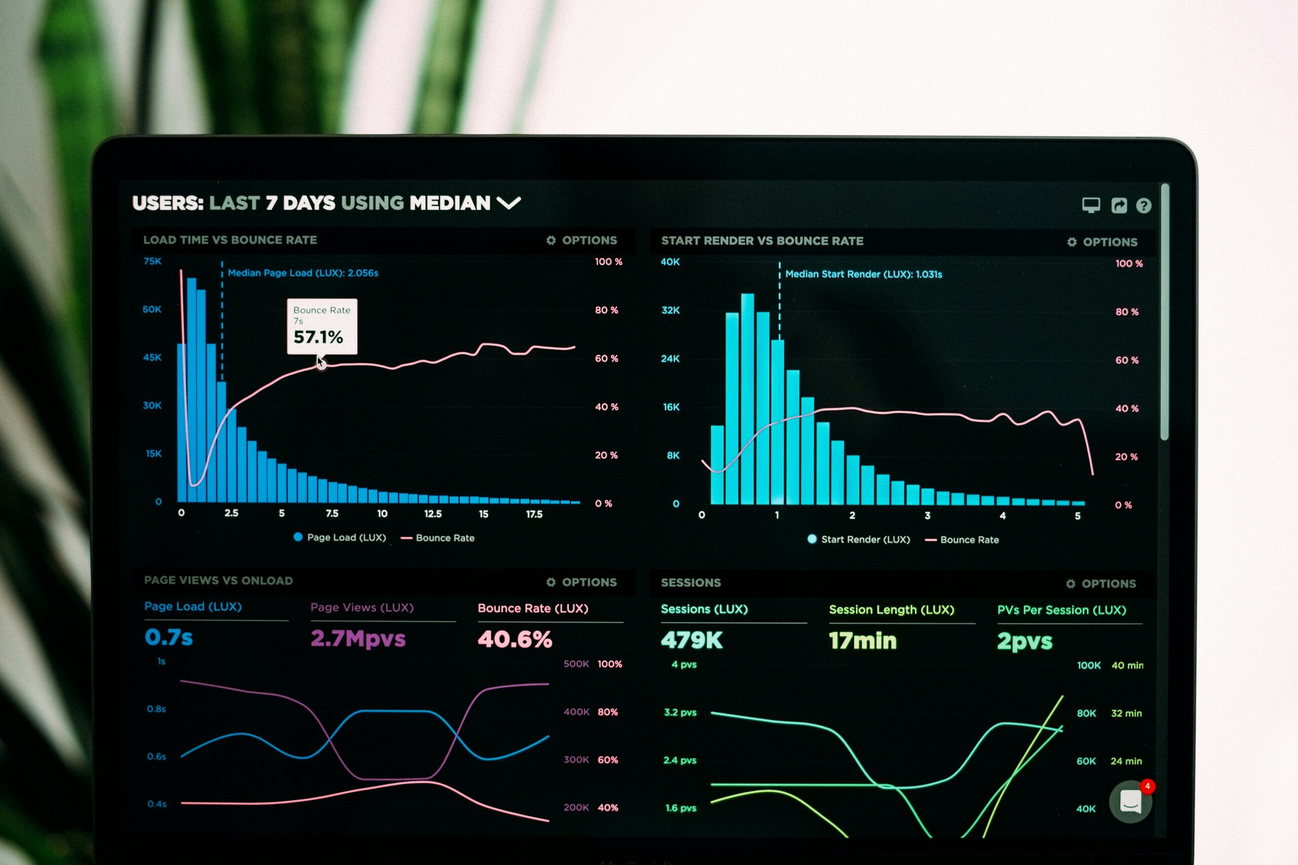
Histograms are powerful tools in data analysis, offering insights into the distribution and patterns within datasets.
Comparing histograms allows us to discern similarities, differences, and trends between two datasets, unlocking valuable insights that inform decision-making and strategy.
In this guide, we’ll delve into comparing histograms, equipping you with the skills to boost your data analysis prowess.
Whether you’re exploring trends in market research, investigating fluctuations in financial data, or analyzing the distribution of variables in scientific research, mastering the comparison of histograms is an essential skill in any data analyst’s toolkit.
Join us as we unravel the intricacies of comparing histograms and unlock the potential of your data analysis endeavors.
Key Takeaways
-
- Understanding histograms is critical as they provide a visual summary of data distribution.
-
- Key components of histograms include bins, frequencies, and shapes that help in meaningful analysis.
-
- Methods for comparing histograms include overlay method, side-by-side method, summary statistics, and Kolmogorov-Smirnov test.
-
- Choosing the right comparison technique depends on factors like data type, distribution, sample size, and level of detail needed.
-
- Practical tips for effective comparison involve aligning bin widths, normalizing data, choosing the right metric, considering data transformation, visualizing overlays, and using interactive tools.
Understanding Histograms
When comparing histograms, it’s critical to first understand what they represent.
Histograms are graphical representations of data distribution, displaying the frequency of values within specified intervals.
They provide a visual summary of the data, showing patterns such as skewness, modality, and outliers.
Here are some key points to consider when interpreting histograms:
-
- Bin Size: The width of the intervals (bins) in a histogram can impact the visual representation of the data.
-
- Bar Heights: The height of each bar corresponds to the frequency of data points within that interval.
-
- Shape: The shape of the histogram can indicate the data’s distribution (e.g., normal, skewed, bimodal).
Key Components of a Histogram
When comparing two histograms, understanding the key components is important for a meaningful analysis:
-
- Bins: These represent intervals where data falls into, affecting the visualization of the distribution.
-
- Frequency: The height of the bars in a histogram corresponds to the frequency of data points within each bin.
-
- Shapes: Different shapes indicate distinct distribution characteristics like symmetry, skewness, or modality.
Methods for Comparing Histograms
When comparing histograms to gain useful ideas from different datasets, there are several methods we can use.
Here’s how we can effectively evaluate and compare histograms:
-
- Overlay Method: Overlaying histograms of the two datasets on the same plot allows us to visually compare the distribution shapes and patterns. This method helps identify changes and similarities at a glance.
-
- Side-by-Side Method: Placing the histograms of both datasets next to each other provides a clear view of their distribution characteristics. Comparing the histograms side by side aids in spotting discrepancies and anomalies between the datasets.
-
- Summary Statistics: Calculating summary statistics such as mean, median, and standard deviation for each dataset can offer quantitative ideas about the changes in the data distribution.
-
- Kolmogorov-Smirnov Test: Applying the Kolmogorov-Smirnov test helps determine whether the two datasets come from the same distribution or not. This statistical test is useful for formally assessing the similarity between histograms.
Choosing the Right Comparison Technique
When it comes to comparing histograms, selecting the appropriate comparison technique is critical for obtaining accurate ideas from the data.
Here are some points to consider helping us choose the right method:
-
- Understand the Data: Before selecting a comparison technique, we need to thoroughly understand the data we are working with. Is it continuous or categorical data? Are we looking for visual similarities or quantitative changes?
-
- Consider the Data Distribution: It’s super important to take into account the distribution of the data in the histograms. Are the distributions normal or skewed? Different comparison techniques are more suitable for specific distribution types.
-
- Evaluate the Sample Size: The size of the samples being compared can also influence the choice of comparison technique. Some methods are better suited for large sample sizes, while others are more appropriate for smaller datasets.
-
- Assess the Level of Detail Needed: Depending on the level of detail required for the comparison, we may opt for visual methods like overlays or side-by-side histograms, or quantitative methods such as summary statistics or statistical tests.
Practical Tips for Effective Comparison
When comparing two histograms, it’s super important to follow certain practical tips to ensure accuracy and meaningful ideas.
Here are some key strategies to consider for an effective comparison:
-
- Align Bin Widths: Ensuring that the histograms have consistent bin widths is critical for a fair comparison. Misaligned bins can distort the visual representation and lead to inaccurate endings.
-
- Normalize Data: Before comparison, normalize the data to account for any changes in sample sizes or data distributions. Normalization allows for a more equitable comparison between the two histograms.
-
- Choose the Right Metric: Selecting the appropriate comparison metric is required. Whether using Kullback-Leibler divergence or Wasserstein distance, the metric should align with the specific goals of the comparison.
-
- Consider Data Transformation: In certain cases, data transformation may be necessary to make the histograms more comparable. Techniques like logarithmic scaling can help address skewed distributions.
-
- Visualize Overlays: To help a visual comparison, consider overlaying the histograms on the same plot. This allows for direct visual inspection of changes and similarities.
-
- Interactive Tools: Use interactive visualization tools to investigate more into the comparison. Tools like Plotly or Tableau offer hard-to-understand ways to investigate histogram disparities.
Mastering the art of comparing histograms empowers you to extract deeper insights, make informed decisions, and uncover hidden patterns within your data.
By honing these skills, you elevate your proficiency in data analysis, positioning yourself as a formidable asset in any analytical endeavor.
Whether you’re navigating the complexities of market trends, deciphering the intricacies of financial data, or unraveling the mysteries of scientific research, the ability to compare histograms equips you with a powerful toolset.
As you continue to refine your data analysis skills, remember that the journey of learning is ongoing.
Embrace each challenge as an opportunity for growth, and let your newfound expertise in comparing histograms propel you toward greater success in your analytical pursuits.


