In data science, some underlying assumptions are made when you use specific machine learning models.
Many of these assumptions are based on the distributions of your data.
With this 5-minute read, we will explore how to find the current distributions of your dependent and independent variables, and also over some models and what distributions they need.
How To Create a Q-Q Plot in Python using SciPy
import scipy.stats as stats
import matplotlib.pyplot as plt

# pull in some random data
df = pd.read_csv('ds_salaries.csv')

# lets work with salary
df = df[['salary']]

# use scipy.stats to plot against a norm
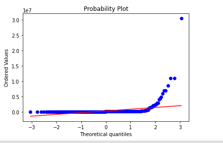
stats.probplot(df['salary'], dist="norm", plot=plt)
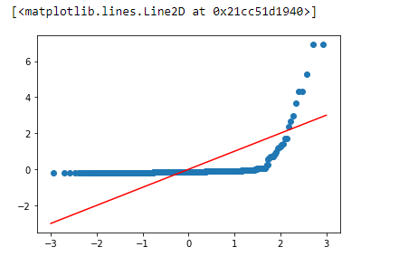
As we see above, our values are not normally distributed.
We could utilize transformations like box-cox and np.log to try to move data into normality.
After applying the transformations, we can replot and check.
import scipy.stats as stats
import matplotlib.pyplot as plt

# pull in some random data
df = pd.read_csv('ds_salaries.csv')

# lets work with salary
df = df[['salary']]

# use scipy.stats to plot against a norm
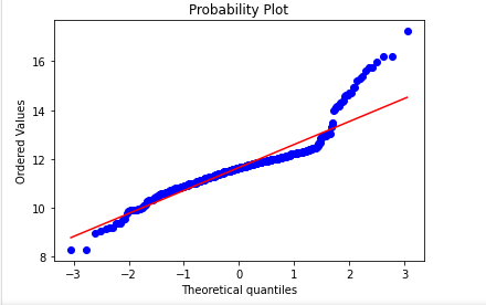
stats.probplot(np.log(df['salary']), dist="norm", plot=plt)
This is much closer to normality but still needs work on the tails.
How to Create a Q-Q Plot Manually in Python Using Pandas, Matplotlib and SciPy
# imports
import numpy as np
import pandas as pd
import matplotlib.pyplot as plt
from scipy.special import ndtri

# pull in some random data
df = pd.read_csv('ds_salaries.csv')

# lets work with salary
df = df[['job_title','salary']]

# see our dataframe
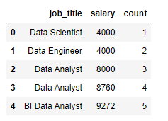
df.head()
# to build our Q-Q plot, sort the col in asc
df = df.sort_values(by=['salary'], ascending=True).reset_index(drop=True)

# let's run a counter variable to see what we're doing
df['count'] = df.index + 1

df.head()
# build out our points to be plotted
# take the point - the mean of the column
# divided by the std of that column
df['comparison_points'] = (df['salary'] - df['salary'].mean())\
                          /df['salary'].std(ddof=0)


# need to compare these to what the real points should be
# this is the row number divided by total number of rows
# remember, these plots are sequential

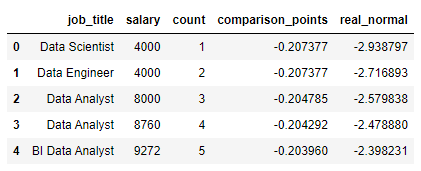
df['real_normal'] = ndtri(df['count']/df.shape[0])


df.head()
# we would want all plots to line up on our line
# we quickly see this is not the case
# our salary data is not normal

plt.scatter(df['real_normal'],df['comparison_points'])
plt.plot([-3,-2,-1,0,1,2,3],[-3,-2,-1,0,1,2,3], color='red')
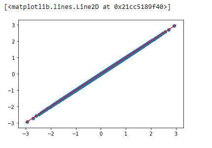
We get this plot if we switch out our data for what the actual distribution should look like below.
# example of a normal plot (from our values)
plt.scatter(df['real_normal'],df['real_normal'])
plt.plot([-3,-2,-1,0,1,2,3],[-3,-2,-1,0,1,2,3], color='red')
While I know it’s theoretical, with a plot like the one above, we can confidently say our data is normally distributed.
What are probability distributions?
Probability distributions are a very dense subject, and the easiest way to think about them is just a pool of values.
And with this pool of values, when pulling values from it, the values you pull will (hopefully) resemble the same distribution as the original probability distribution.
For this to happen, you’ll need to pull a decent amount of values from your original distribution.
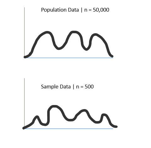
For example, check the chart below, where we pull 500 random points from a population (size 50,000).
As we can see, our sample distribution nearly matches our population data but has a much lower count.
This is important because we rarely have access to the whole population data.
Still, it shows that if we have enough samples, our sample distribution will follow the same distribution as the population data.
Why are probability distribution types important in data science
This idea of underlying distributions quickly becomes vital in data science.
This is because many statistical tests have the assumption of normality.
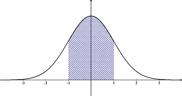
The normal distribution looks like a bell curve and is foundational in many data science and machine learning applications.
What is the normality assumption in statistics?
The normality assumption in statistics is that the population’s standard deviation is independent of the population’s mean, which only happens in normally distributed data. This is foundational in hypothesis testing, where the normality of data is assumed before running the test.
Normality Assumption in Linear Regression
With a linear regression model, the plot of the residuals should follow a normal distribution. This can be checked with a QQ Plot or a Shapiro-Wilk test. If your model does not show this, non-normality is sometimes an indicator of outliers or multicollinearity.
How QQ plots can help us identify the distribution types
QQ plots help us identify distribution types by visually comparing data from two different sources onto one plot. This quickly allows us to see if our data follows the tested distribution. A QQ plot can be used to test for a match with any distribution.
An error that is commonly made is that QQ plots are only for the normal distribution.
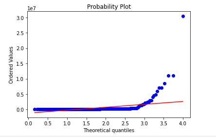
This is entirely false. Here is a QQ plot testing for the maxwell distribution using scipy against a salary dataset.
As we can see, our data does not come from a maxwell distribution.
import scipy.stats as stats
import matplotlib.pyplot as plt

# pull in some random data
df = pd.read_csv('ds_salaries.csv')

# lets work with salary
df = df[['salary']]

# use scipy.stats to plot against a norm
stats.probplot(df['salary'], dist=stats.maxwell, plot=plt)
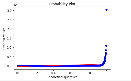
Here is another testing my example data for the uniform distribution, where the values range from [0,1].
We could have easily used any distribution, like the chi-square distribution.
import scipy.stats as stats
import matplotlib.pyplot as plt

# pull in some random data
df = pd.read_csv('ds_salaries.csv')

# lets work with salary
df = df[['salary']]

# use scipy.stats to plot against a norm
stats.probplot(df['salary'], dist=stats.uniform, plot=plt)
How The QQ Plot Can Ensure Your Data Is The Right Distribution
The QQ Plot can ensure your data is the correct distribution because your data and the data from the distribution will match perfectly. If they do not, your data is either from a different distribution, has outliers, or is skewed, altering it off the true theoretical distribution.
Frequently Asked Questions
What does the QQ plot tell us?
A QQ plot tells you if the data you currently have matches the distribution you are testing it against. This involves two datasets as you compare your dataset to the standardized line that comes from the theoretical quantiles of your suspected distribution.
Why is the QQ plot used?
A QQ plot is used because it gives a visual representation of your dataset compared to a distribution. The QQ plot quickly allows you to identify if your data matches your proposed distribution. It also allows you to identify skewness, tails, and potential bimodal situations.


