Heatmaps are great for quickly visualizing data that normally isn’t easy to ingest.
However, it sometimes feels impossible to find a coding resource that shows you how to code up these heatmaps in Python, and what they’ll look like when you’re done.
For this tutorial, we’ll simply use the data frame below to implement these different heatmaps.
This will allow you to implement a quick visual and code comparison for your project!
import pandas as pd
import numpy as np

# example data
#https://www.kaggle.com/datasets/uciml/red-wine-quality-cortez-et-al-2009
df = pd.read_csv('winequality-red.csv')

# take the last 5 columns
df=df[[col for col in df.columns[5:]]]

# we will heatmap the correlations
corr = df.corr()

corr
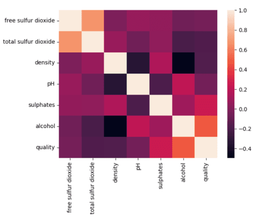
How To Code A Heatmap In Seaborn
A standard in data science, Seaborn has one of the easiest-to-implement heatmaps.
This package is built on top of matplotlib and is one of my favorite packages for plotting distributions.
While I think this package struggles with customization, getting a heatmap out in one line of code quickly is extremely attractive.
Read more about Seaborn here or the initial paper here.
import seaborn as sns

sns.heatmap(corr)
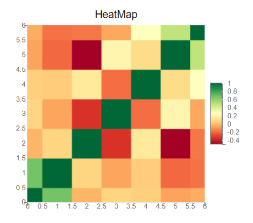
How To Code A Heatmap In Plotly
Plotly is an interactive graphing library that has been on the rise for some time.
With mountains of examples and a community hangout where users exchange questions and code – you can’t really go wrong with Plotly.
Personally, I think their simple implementation of a heatmap is one of the best looking and is one I use when I don’t need special customization.
from plotnine import ggplot, aes, geom_tile, geom_text
from plotnine import scale_fill_gradientn, ggtitle
import pandas as pd
import numpy as np

# melt down our dataframe
melted_corr = corr.melt()

# repeat the columns
a = np.array([col for col in corr])
melted_corr = melted_corr\
                .assign(variable2=a[np.arange(len(melted_corr)) % len(a)])

# create a figure
fig = plt.figure()

# plot, we can add whatever we want
# I added tiles forexample
ggplot(melted_corr, aes(x=melted_corr['variable'],
                        y=melted_corr['variable2'],
                        fill=melted_corr['value']))\
                        + geom_tile()\
                        + geom_text(aes(label = \
                                        round(melted_corr['value'], 3)))
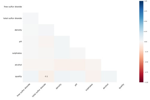
How To Code A Heatmap In bqplot
bqplot is an interactive visualization tool for the jupyter environment, bringing customer-ready visualizations to your customers with minimal code.
While the visual aspects of bqplot can mostly be found in plotly, the ability to have interactive charts right in your jupyter environment is a huge plus.
Since I do a lot of coding in jupyter notebooks, I’ll leverage bqplot if I know I will have a stakeholder viewing my visualizations.
That way, they’ll be able to interact with the charts.
import missingno as msno
import random
%matplotlib inline


# random index values
ix = [(row, col) for row in range(df.shape[0]) for col in range(df.shape[1])]

# create nulls for 20% of the data
for row, col in random.sample(ix, int(round(.2 * len(ix)))):
    df.iat[row, col] = np.nan

# show our heatmap
msno.heatmap(df)
How To Code A Heatmap in Cufflinks
Cufflinks is great for the average data scientist.
This package is built on top of plotly and pandas, which seems to work perfectly for data scientists, as most of the data is in dataframes.
One of my personal favorite packages that really starts to show its strength when it comes to “stacking” charts together.
While this package packs a lot of power, it seems not to be actively managed, as no commits seem to have been merged within the last three years.
It’s still a powerful tool you should know; read more about it here.
import cufflinks as cf
from plotly.offline import iplot
cf.go_offline() #will make cufflinks offline
cf.set_config_file(offline=False, world_readable=True)


corr.iplot(kind='heatmap', colorscale='rdpu' )

# some other colors that can be used for cufflinks heatmap
# dark2, dflt, ggplot, gnbu
# greens, greys, oranges
# original, orrd, paired
# pastel1, pastel2, piyg
# plotly, polar, prgn,
# pubu, pubugn, puor,
# purd, purples, rdbu
# rdgy, rdpu, rdylbu,
# rdylgn, reds, set1
# set2, set3, spectral
# ylgn, ylgnbu,
# ylorbr, ylorrd
How To Code A Heatmap in Lightning Viz
Finally, a python based graphing solution for your web apps.
Lightning provides API-based access to all your apps and is supported in Python, Javascript, Scala, and R.
I worry if this project is being maintained, as their SSL certificate has gone missing, and they’ve shut down their test server.
Anyways, if you’re willing to start up your own server, the code still exists and can be utilized.
Stewart Kaplan has years of experience as a Senior Data Scientist. He enjoys coding and teaching and has created this website to make Machine Learning accessible to everyone.